Brand Identity System · Version 1.0
Creative Crusader

Creative Crusader Brand

A calligraphic identity system built from strategy, story, impact, and the pursuit of creative work that deserves a crown.

Ferrari red. Brushed metal. Graphite command. Marble clarity.

Brand Manifesto

We believe ideas deserve better than decoration.

We believe strategy needs story.

We believe design should carry weight.

We believe the smallest detail can change how a brand is remembered.

We believe creativity should be measured not only by beauty, but by impact.

We are Creative Crusader.

Bold ideas. Measurable impact.
The Brand Idea

Why "Creative Crusader"?

Creative Crusader was created for people and brands that believe creativity should not be decoration. It should move things — sharpen strategy, improve perception, build trust, and create measurable commercial impact.

The brand name is intentionally memorable. "Creative" brings imagination. "Crusader" brings conviction. Together they create a character: someone who protects the standard of creative work.

The word Crusader becomes an icebreaker. It starts a conversation and gives the brand a point of view — a champion of creativity committed to placing a creative crown on every piece of work.

Core Brand Line
Bold ideas. Measurable impact.
Creative
Imagination
Strategy
Originality
Storytelling
Intelligent design
Sharp execution
Crusader
Conviction
Championing better ideas
Protecting creative quality
Fighting forgettable work
Placing a creative crown on everything
Creative Crusader Red Black wordmark
Design Philosophy

Why Calligraphy?

The Creative Crusader wordmark is not a normal typed logo. It is a calligraphic identity. The handwritten wordmark gives the brand a personal signature — something no font library can replicate.

Calligraphy is used because Creative Crusader is not built on generic templates. It is built on taste, discipline, and expressive detail.

Patience
Detail
Control
Elegance
Heritage
Craft
Personality
Human touch

"It should feel like an old master's signature. A luxury atelier mark. A founder's personal stamp. A handcrafted promise."

Visual System

Design Theory

The identity is built around contrast: old ink and modern interface, Ferrari red and graphite black, calligraphy and performance dashboards.

Calligraphy

Human craft and signature authority. The name is the mark — not an icon, not a symbol.

Ferrari Red

Passion, speed, courage, urgency, action. Used for emphasis, CTAs, and the 'Creative' word.

Graphite / Carbon

Discipline, power, seriousness, depth. The environment where strong ideas are shaped.

Titanium / Metal

Precision, durability, engineering, premium craft. Sparingly, for special moments.

Marble White

Clarity, space, refinement, written thought. Clean surfaces for ideas to breathe.

🖋
Ink & Parchment

Writing, thinking, sketching, strategy. The human origin of every great idea.

Old ink meeting a modern premium interface.

Ferrari performance meets strategic craftsmanship.

Identity Colours

Colour & Material System

Click any hex code to copy it. Each colour is chosen for a precise role in the identity.

Ferrari Ember
#D71920

Action, highlights, the 'Creative' word, flourishes, strategic energy

Ink Black
#111111

Premium contrast, body copy on light sections, 'Crusader' on light

Signal White
#F7F7F2

'Crusader' on dark backgrounds, clean space, elegant contrast

Graphite Command
#1A1A1A

Dark UI panels, navigation, footer, luxury website surfaces

Midnight Navy
#071426

Deep digital sections, cinematic backgrounds, premium depth

Brushed Platinum
#C0C0C0

Metallic wordmark, premium dividers, refined detail

Parchment Canvas
#F7F1E5

Paper-style sections, editorial layouts, brand guideline areas

Stone Grey
#8E8E8E

Secondary text, muted borders, supporting information

Type System

Typography

Three typefaces. One role each. The calligraphy is the signature — the interface must remain clean and readable.

Display / Headlines
Bold Ideas.
Cinzel

Page titles, manifesto headings, brand moments, editorial sections.

Accent / Editorial
Measurable Impact.
Cormorant Garamond

Italic accents, pull quotes, signature editorial moments.

Interface / Body
Strategy. Story.
Inter

Body copy, navigation, buttons, cards, downloads, and all technical information.

Identity Lockup

Wordmark System

Three approved versions. The name is the mark. The flourish is the signature stroke — part of the formal lockup.

Red + White
Red + White

Primary version for dark digital surfaces: website hero, dark navigation, app screens, social banners.

Download PNG
Red + Black
Red + Black

Light-background version for paper, canvas, proposals, decks, documents, and off-white sections.

Download PNG
Silver / Metallic
Silver / Metallic

Premium special-use only: covers, event visuals, hero lockups, intro screens, and high-impact moments.

Download PNG
Usage Rules

How to Use the Logo

Keep clear breathing space — minimum equal to the lowercase 'r' height on all sides.

Use the Red + White version on dark digital surfaces, graphite, midnight navy, or dark hero sections.

Use the Red + Black version on light, paper, parchment, canvas, or marble backgrounds.

Use the metallic Silver version only for premium moments: covers, event visuals, and intro screens.

Ensure the logo is always large enough that the hairlines remain crisp and readable.

Keep the flourish as part of the formal lockup. It is a signature stroke, not decoration.

Place the logo on clean surfaces. If using over photography, apply a dark or paper overlay first.

Allow the wordmark to carry authority on its own. Do not crowd it with taglines or nearby text.

Restrictions

What Not To Do

The wordmark is delicate and expressive. Protect its legibility and preserve the handwritten authority.

Do not add a shield, CC icon, crest, mascot, or crusader illustration.

Do not redraw the letters or replace the calligraphy with a generic script font.

Do not compress, stretch, tilt, or distort the wordmark.

Do not place the Red + White version on pale backgrounds or the Red + Black on dark surfaces.

Do not add heavy neon glows, bevels, cartoon shadows, or fake 3D effects.

Do not remove the flourish from the formal lockup unless using an approved compact header crop.

Do not use handwriting for long body copy. Keep it for accents, notes, and signatures only.

Do not overcrowd the logo with taglines, icons, borders, or decorative frames.

Do not invent a CC symbol or monogram unless specifically approved.

Do not make the logo so small that the hairlines disappear.

Material Inspiration

The Finish Story

Each material reference carries meaning. These are strategic choices, not decorative ones.

Ferrari Red Gloss

Passion, movement, energy, ambition, and decisive creative action.

Brushed Titanium

Precision, durability, engineering, resilience, and the strength behind polished work.

Brushed Platinum

Premium craft, rare detail, elegance, and high-value presentation.

Marble White

Clarity, discipline, calm thinking, and space for ideas to breathe.

Graphite & Carbon Black

Seriousness, command, depth, and the environment where strong ideas are shaped.

Parchment & Ink

Writing, thinking, sketching, strategy, calligraphy, and the human origin of ideas.

Visual Reference

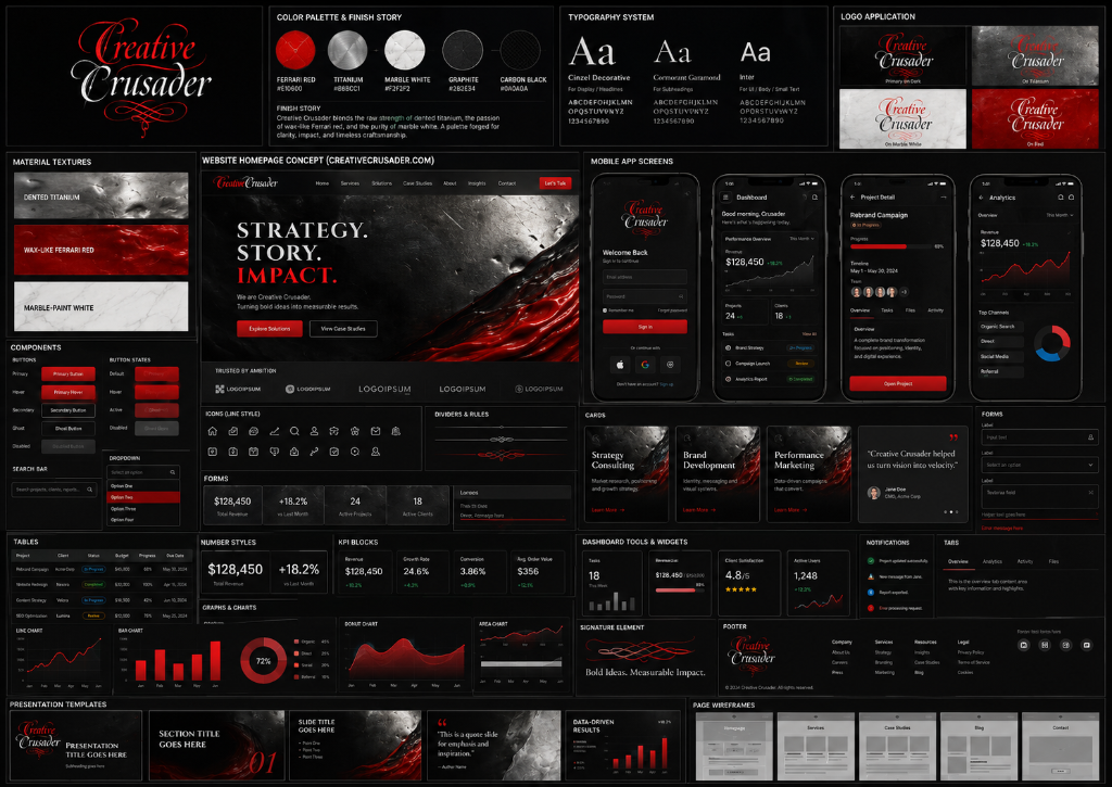
UI/UX Mood Board

The full design system in one reference — colours, type, components, dashboard treatments, and brand application across digital surfaces.

Creative Crusader UI/UX Mood Board
Asset Library

Download Brand Assets

Approved brand files for consistent application across all surfaces.

Logos
Red + White Wordmark
PNG

For dark digital backgrounds, app screens, and social banners.

Download PNG
Red + Black Wordmark
PNG

For light backgrounds, paper, proposals, and documents.

Download PNG
Silver Metallic Wordmark
PNG

Premium special-use for covers, event visuals, and hero screens.

Download PNG
Brand Guidelines
📄
Wordmark Guidelines
PDF

Full brand guidelines: wordmark system, colours, usage rules, incorrect usage, and file inventory. 7 pages.

Download PDF
Free Digital Assets

Creative Crusader Digital Asset Pack

Backgrounds, wallpapers, and social templates following the brand system — dark graphite, Ferrari red, titanium metal, marble white. For people who appreciate bold ideas and disciplined creative execution.

Video Call Background
Desktop Wallpaper
Mobile Wallpaper
Tablet Wallpaper
LinkedIn Banner
Instagram Story
Instagram Square
Email Signature Strip
Dark Strategy Background
Ferrari Red Wallpaper

Contact Creative Crusader to request the digital asset pack.

Request Asset Pack
Brand Use & Permissions

Protecting the Identity

Please use the Creative Crusader assets respectfully and consistently. Do not alter, redraw, distort, recolour, or combine the wordmark with unapproved symbols. The calligraphic wordmark is the mark.

For partnerships, press, production files, or special usage permissions, contact Creative Crusader directly.

Contact Creative Crusader
Creative Crusader

Strategy. Story. Impact.

Bold ideas. Measurable impact.